Benjamin Moore Color Trends 2026: Color Spotlight Series
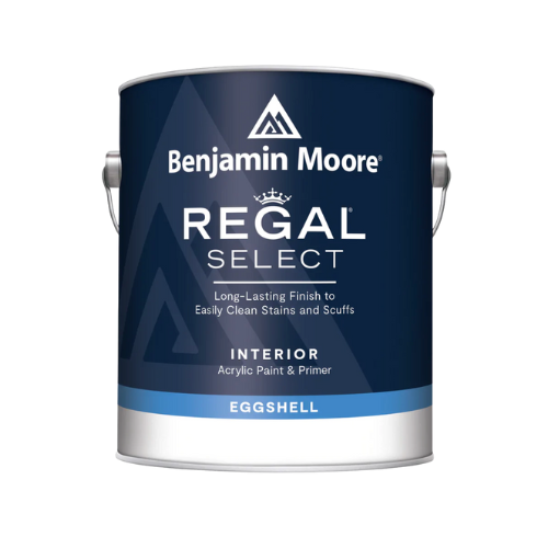
As a trusted Benjamin Moore dealer in New Jersey, Ricciardi Brothers continues ourColor Spotlight Series, where we explore each shade from the Benjamin Moore Color Trends 2026 palette — how they perform in real spaces, pairing ideas that work beautifully, and similar hues worth sampling.
Here, we’re highlighting Raindance 1572, a soft, steely green with easygoing gray undertones that feels both calming and sophisticated. It brings a balanced, natural quality to interiors without feeling cold or flat — making it a versatile choice for many design styles.

Meet Raindance 1572
Raindance 1572 occupies that sweet spot between green and gray. With subtle blue‑green depth and just enough gray influence, it creates a soothing backdrop that can feel both fresh and grounded depending on light and context.
This hue is ideal when you want a color that quietly enhances a space without dominating it. Whether you’re updating walls, cabinetry, or even built‑ins, Raindance adds a layer of calm sophistication that works beautifully in both casual and more refined environments.
Best uses for Raindance 1572 include:
-
-
Living rooms and family areas
-
Dining rooms and kitchens
-
Bedrooms and bathrooms
-
Accent walls or cabinetry
-
Transitional spaces like hallways or home offices
Its balanced personality makes it a natural choice forcoastal, transitional, modern, and organic interiors. It reads as both serene and intentional — a refined alternative to classic sage or gray.
Why Raindance Earns a Spotlight
Raindance stands out in the 2026 palette because it blendsnatural calm with subtle complexity. It has a mineral, stone‑inspired quality that feels grounded, yet its green‑leaning undertones bring a sense of freshness not always found in similar neutrals.
This combination makes it especially appealing for spaces where you want an inviting, soft atmosphere that still feels purposeful. Whether paired with warm woods, crisp whites, or deeper accent tones, Raindance adds depth and dimension while remaining remarkably easy to live with.

Colors That Pair Beautifully with Raindance
Here are some coordinating colors from Benjamin Moore’s palette that work beautifully with Raindance 1572:
Soft Neutrals & Light Bases:
Accent or Earthy Depths:

Pearl Gray 863 – A gentle gray that enhances the peaceful vibe without competing.

Baked Clay 035 – A warm, earthy accent that contrasts beautifully with the cool tones.
These pairings create cohesive, layered color stories — from soft and serene to warm and grounded — depending on the mood you want to evoke.
Similar Benjamin Moore Colors to Try
If you’re drawn to Raindance 1572 but want to explore nearby hues, here are some similar options from the Benjamin Moore palette:
Sampling these hues with Benjamin Moore color samples or Peel & Stick samples lets you see how each interacts with your home’s lighting, finishes, and furnishings.

See Raindance in Person at Ricciardi Brothers
Choosing the right color — especially a nuanced tone like Raindance 1572 — is easier when you can see it in person. As a localBenjamin Moore paint store in New Jersey, Ricciardi Brothers offers expert color guidance, large color displays, and real paint samples to help you feel confident in your choice.
Visit one of our showrooms to:
Stay tuned as we continue our Benjamin Moore Color Trends 2026: Color Spotlight Series, where we dive deeper into each color from the palette and explore how to bring these shades to life in your home.