In the vast realm of interior design and architecture, paint does more than just decorate. It has the power to direct, guide, and assist. For the visually impaired, navigating public spaces can be challenging. However, by harnessing the power of contrast with strategic paint choices, we can make public domains more accessible and user-friendly for everyone. Ricciardi Brothers, in collaboration with Benjamin Moore, delves into the importance of integrating contrast in public spaces and offers solutions for a more inclusive environment.
- The Power of High Contrast:
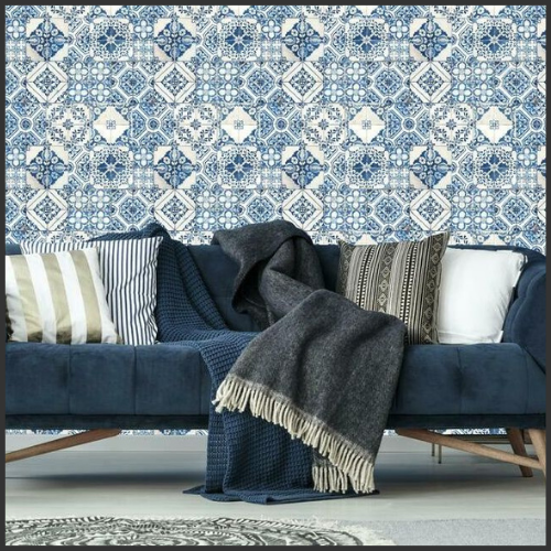
High contrast color schemes make it easier for those with visual impairments to distinguish between surfaces, objects, and essential focal points. Using a light color against a dark background (or vice versa) can highlight edges, boundaries, and important navigation points.

- Pathways and Corridors:
By using contrasting paint colors for walls and floors, or for the lower part of the wall compared to the upper half, pathways become more distinguishable. This guides individuals with visual impairments more confidently through hallways and corridors.
- Staircases and Level Changes:
One of the most hazardous areas for the visually impaired can be staircases or any sudden change in floor level. Painting the edges of steps in a contrasting color can significantly reduce the risk of accidents.

- Doors and Entrances:
For door frames and entrances, a contrasting color from the surrounding wall ensures that doorways are easily recognizable. Moreover, using different colors for push and pull sides of doors can further enhance usability.
- Signage and Information Boards:
High contrast between text and background on signs ensures that any residual vision is maximized, and important information is more discernible.
- Restrooms and Utility Areas:
Distinguish different facilities by using contrasting paint colors for walls or doors. For example, male and female restrooms can be painted in different colors, and the color contrast principle can be applied to other utility areas like elevators, waiting rooms, or information desks.
The Benjamin Moore Difference:
With Benjamin Moore's expansive color palette, public spaces don't need to sacrifice aesthetics for functionality. There's a myriad of attractive contrasting color combinations to choose from, ensuring that spaces are both beautiful and accommodating.
Importance of Public Feedback:
It's imperative to involve visually impaired individuals in the design process. Their feedback ensures that chosen contrasts work effectively in real-life scenarios.
Conclusion:
Inclusivity is more than just a buzzword; it's a responsibility. By recognizing the unique challenges faced by the visually impaired and taking steps to address them, we can craft public spaces that truly cater to everyone. With strategic paint choices, Ricciardi Brothers and Benjamin Moore are proud to champion a movement towards a more inclusive world.
Looking to redesign a public space with accessibility in mind? Turn to Ricciardi Brothers and Benjamin Moore for expert guidance and premium paint selections.